Color Challenge Catch-Up
I've been (mostly) keeping up with my weekly Color Challenge blocks (except for this past week, when I spent all my free time finishing my beach bag).
If you haven't checked out the Color Challenge over at 15 Minutes Play, you should definitely do so! It's so interesting to see everyone else's blocks, and the woman who started it all, Victoria, is an incredibly talented quilter and colorist.
Here are my most recent blocks.
Grape
For someone who went to a university that boasted purple and white as its colors, I sure don't have much in my stash! I admit, even after four years of wearing purple, it isn't really one of my favorites.
Yellow was the obvious first choice for me, but I didn't like the first couple I tried--the darker lines in this yellow seemed to help it out. I was really surprised that the blue worked--in my mind it seemed too close to the purple. I didn't want to go very pinky, but the aboriginal dot light purple/pink seemed to set off the purple nicely. Ultimately, for me, purple is just a tough color to work with, and while I'm fine with my block, I'm not feeling any extra love for the hue right now.
Bubblegum Pink
I kept feeling drawn to sugary sweet, bubblegum-y colors for this.
I kept feeling drawn to sugary sweet, bubblegum-y colors for this.
Here's what I ended up using:
And my made fabric:
And my block:
I was not expecting to pair the orangey-red with mint, but I liked how the warm and cool complemented each other. I'm not usually a big pastel fan, but throughout this color challenge I'm seeing how pastels can be paired with brighter colors for interesting impact.
And my made fabric:
And my block:
I think it really has that sugary sweet bubblegum feeling to it. I especially like it with the lime green and the yellow dotted print. Pink is not usually a huge favorite of mine (I just feel like it gets overused for little girls, but that's another soapbox for another day). However I really like all the black, white and pink blocks that others made, and I like how easily it works with a variety of colors in general. I think I may have to overcome my prejudice against it and try a quilt that is primarily pink.
Mint Green
The color mint green has another flavor connotation, too...check out the key lime pie custard I ate before sewing my block!
With that "inspiration" in my belly, I pulled out these fabrics:
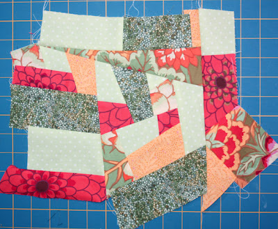
I found the third fabric and loved the orangey-red paired with the mint and sage greens, so I looked for that color in my stash. Only after finishing the block did I realize that its colors were similar to my tomato red block!
And here's my made fabric:
And my block:
I was not expecting to pair the orangey-red with mint, but I liked how the warm and cool complemented each other. I'm not usually a big pastel fan, but throughout this color challenge I'm seeing how pastels can be paired with brighter colors for interesting impact.
Aqua
My aqua was plenty bright, so there was no confusing it with mint. (Although when you pair this aqua with the chocolate brown, I'm seeing mint chip ice cream here too!)
My made fabric:
And my finished block:
I love how the bright colors and how they pop with the aqua, but that they're grounded with the brown. I like how the bright colors keep the aqua looking fresh.
Maroon
This was a third attempt at fabric choices for me. I too kept running into the maroon and gold school colors issue. Then I found the small squares fabric and the green millefiore fabric and knew that I'd found my direction. I was pleasantly surprised to see how the coral and the blue worked too--maroon is more friendly than I'd expected. I wasn't expecting to like this block, but I really do!
My made fabric:
And my finished block:
To see my previous Color Challenge post, showing Tomato Red, click here.


